Introduction (statement of inquiry)
- Why is corporate identity important?
- How much can you say with a logo?
- Are the cost associated with a logo design worth it?
Logo development
Most of the logos have gone throughout big changes over the years.
Through this week and unit we have been working on the purpose of the logos. This week, we estimated and drew future logos for Apple, Starbucks and Google. I drew Starbucks and Apple. I drew the Starbucks lady a little bit bigger and drew a crown in the bottom to show that Starbucks is the best. However my drawing skill was bad so I decided to talk about apple logo in front of the class.
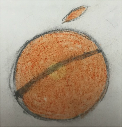
So this is what I think for the future logo of the apple.
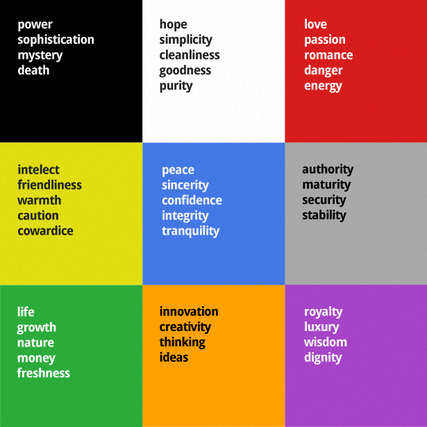
I choose orange because it means 'creativity' and 'thinking'. I think apple is really creative because it is one of the most popular company which sell the most smartphones and i think to do that, they had to be creative. And I also drew a black line from the edge of the circle to another edge. This represent how fast Apple is developing every time they sell a new i-phones and i-pods. And I changed the shape of the logo to make it more simple like how Starbucks logo became more simple.
So this is what I think for the future logo of the apple.
I choose orange because it means 'creativity' and 'thinking'. I think apple is really creative because it is one of the most popular company which sell the most smartphones and i think to do that, they had to be creative. And I also drew a black line from the edge of the circle to another edge. This represent how fast Apple is developing every time they sell a new i-phones and i-pods. And I changed the shape of the logo to make it more simple like how Starbucks logo became more simple.
The meaning of colors
MYP Logo Design (Using Gimp)
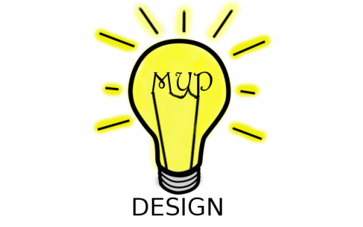
This is the MYP Design Logo that I drew. I drew MYP in the light bulb because I wanted to show that MYP is surrounded and are filled with lots of ideas towards students. I chose yellow as theme color because light bulb is yellow but also yellow represents friendliness and warmth and caution. I think MYP should be more friendly and get more closer to students because I feel like some students don't get MYP and think that MYP is complicated. I picked the color yellow because it also means 'caution'. I want MYP to be careful not to use too many difficult vocabulary because it doesn't really sounds familiar. I think I should have used my time more wisely because I finished my logo and plan right before the due time.
Evaluation
|
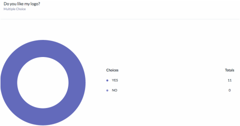
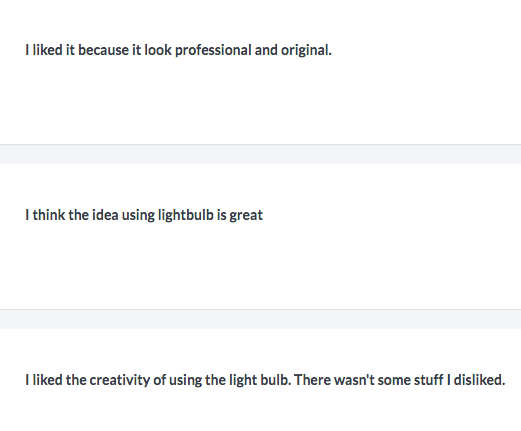
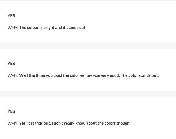
Everyone who did my survey answered that they like my logo. They said they liked it, because using/putting the light bulb is creative and original. People said they think my logo stands out and has good color combinations because light bulb is colored as yellow which is nice and bright. But I personally choose yellow and light bulb because it stands for ‘creativity ‘ and ‘cheerfulness’. And I thought that it fits to the idea of MYP because the MYP is an educational program so it should be creative to get teacher’s and student’s attention. Lastly, people said that I can improve my logo by making things clear, precise and neat.
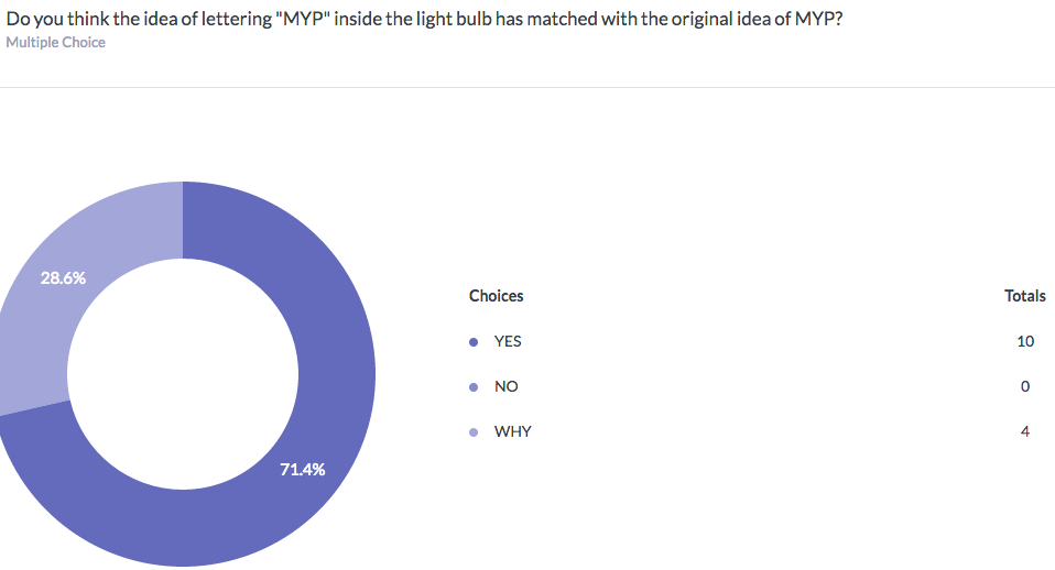
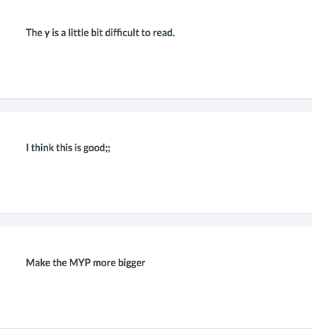
With all these results that I got from the survey, I think I should change the way of lettering MYP because some people said that the “Y” is hard to read and the “MYP” should be bigger. Also I should try to show my logo that it is about the “design ICT”. To do that, I think I can write “Design ICT” below the light bulb or add a picture of a paint brush and paint pallet. ~~~~~~~~~~~~~~~~~~~~~~~~~~~~~~~~~~~~~~~~~~~~~~~~~~~~~~~ Nowadays, lots of companies and corporations use logo. They use them to show the purpose of the company, things they do and their product. When company makes their logo, they spend lots of time and try to make it neat, because people decide if they should buy that company’s items or products by looking at the logo sometime. Company makes the logo more simple and original, so that people will remember their logo. Like how we know that it is McDonald just by looking at the big, yellow “M” sign. They care about the shape of the logo but also colors. Each colors has it’s own meaning. For example, logo of Snap-chat looks like a ghost colored as yellow. I think they chose yellow because it is bright and distinctive but also the color yellow stands for cheerfulness, friendliness and joy. There is a company called “green lab” which has cool logo. “Green” is symbolized by coloring the tree green and lab is represented by brain. And they combined these together and made a tree. Throughout this unit, by looking at other people’s logo and by actually designing my own logo, I have learned that logos are not something complicated and hard but something interesting to learn. 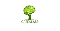

|
